True Autumn Color Palette
Rich, warm, and earthy — these colors resonate with your golden undertone and bring out the warmth in your complexion.
Understanding the True Autumn Color Palette
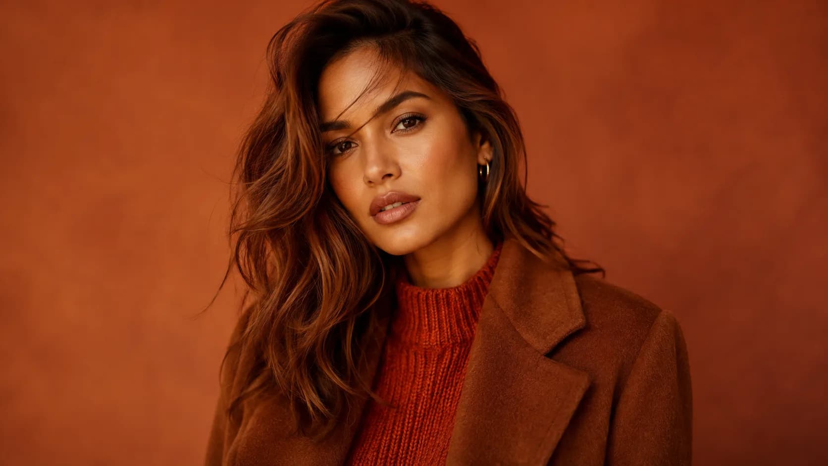
True Autumn is the most quintessentially "autumn" of the four: rust, terracotta, olive, golden brown, mustard. If a color looks at home in a spice market or a pile of fall leaves, it's very likely in this palette. Every shade is warm and earthy, medium in depth, and pulled back just enough from pure brightness to read as rich rather than loud.
Balance is what separates True Autumn from Soft Autumn and Deep Autumn. You sit in the middle of the family on both depth and contrast, wearing colors with more presence than Soft Autumn's dusty versions but without Deep Autumn's near-black weight.
Because the palette leans so heavily on warmth, the fastest way to get it wrong is reaching for anything cool or icy. A single navy or icy-pink piece doesn't read as a crisp contrast on True Autumn. It reads as an undertone clash, since nothing else in the coloring supports that kind of coolness.
True Autumn Signature Colors
8 signature colors from the True Autumn palette, spanning soft neutrals to bold statement shades.
Want your personalized top matches + AI-styled outfit photos? Get your full report →
True Autumn Worst Colors
The colors that hurt a True Autumn palette actively fight the one thing that defines you: warmth. Each one below fails for its own specific reason.
Icy Pink
A pale, blue-based pink has no warmth at all, so it reads as washed-out and slightly cold against True Autumn's golden undertone.
Icy Blue
This cool, pale blue is the opposite of everything in the True Autumn palette. There's no way to make it read as earthy or warm.
Black
Pure black is cool and starkly high-contrast, working against True Autumn's warm, medium-contrast coloring. Dark chocolate brown does the job of a dark neutral instead.
Cool Grey
A neutral, cool grey has no warmth at all, so it reads as flat and lifeless against warm coloring. Even greige needs a visible warm cast to work here.
Navy
Navy is cool and stark where True Autumn is warm and earthy. It creates an undertone clash rather than the crisp neutral it reads as on cooler seasons.
Cool Purple
A bright, blue-based purple is both too cool and too saturated for True Autumn's warm, muted chroma.
Mauve
Mauve is a cool-toned dusty pink. The coolness clashes with True Autumn's golden undertone even though the muted quality might seem to fit.
Hot Pink
A cool-leaning, high-saturation pink with none of the earthy warmth True Autumn needs. It looks synthetic against the palette's natural, spice-toned colors.
Fuchsia
A cool, high-saturation pink-purple with none of the earthy warmth True Autumn needs. It looks synthetic next to the palette's natural, spice-toned colors.
Bright Blue
A true, saturated cool blue sits at the opposite end of the color wheel from everything in this warm, earthy lineup.
Building a True Autumn Capsule Wardrobe
True Autumn's capsule is built around 8 tops and 5 warm, earthy neutrals that all share the same rich, medium-depth register, so anything from the tops list pairs correctly with anything from the bottoms list.
Tops
Bottoms
Outfit Ideas
- —Rust top + Camel trousers: the definitive True Autumn combination, warm and grounded without needing a third color.
- —Forest Green top + Warm Brown bottoms: swaps warmth's intensity for an earthier, more grounded look while staying inside the family.
- —Warm Burgundy layered over Olive: a rich, jewel-adjacent pairing that reads dressed-up without leaving the palette.
- —Mustard as the statement piece against Camel or Warm Brown. Mustard is one of the palette's brightest notes, so it works best as the one bold item in an otherwise earthy outfit.
True Autumn Color Combinations
Both colors in these pairings sit at the same warm, medium-depth register. Nothing in a True Autumn combination should read as cooler or paler than its partner.
Rust + Forest Green
The archetypal True Autumn pairing: a warm red-orange against a muted, earthy green, echoing the palette's spice-and-foliage identity.
Terracotta + Warm Teal
Warm teal is the coolest-reading color in the palette, but it still carries enough warmth to sit comfortably next to terracotta rather than fighting it.
Golden Brown + Mustard
A neutral-plus-accent formula: golden brown grounds the look while mustard, the palette's boldest note, carries the attention.
Warm Burgundy + Camel
A richer, more autumnal alternative to red-and-neutral, since warm burgundy has none of the coolness of a true or cool-toned red.
True Autumn Wardrobe and Style
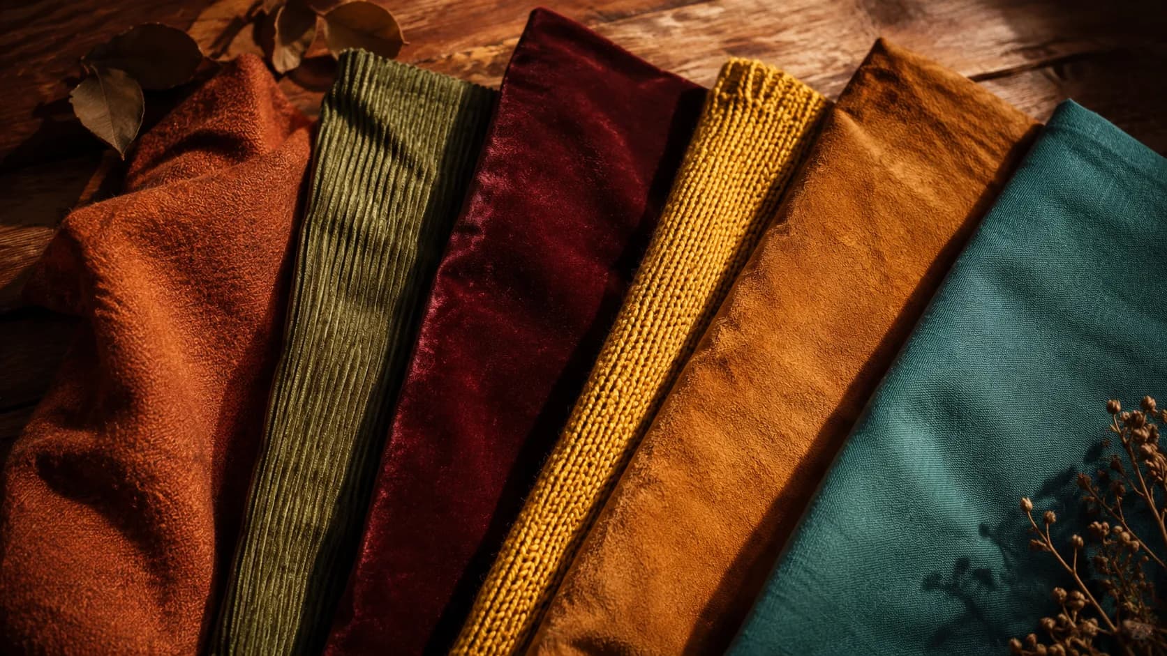
Shop by texture as much as by color. Tweed, corduroy, suede, and wool all read as True Autumn on sight, since their matte, warm-toned finish matches the palette's earthy identity even when the exact shade isn't a perfect match. Skip glossy or icy-finish fabrics, patent leather in black, cool-toned satin, even in an otherwise-correct color. The sheen itself reads cooler than the palette supports.
Core Neutrals
Statement Colors
True Autumn Hair Color Guide
At the salon, lead with "warm" and rule out cool or ash formulas explicitly. Colorists often default to cool-toned trends that fight True Autumn's golden undertone. Copper or auburn highlights woven through a warm chestnut base read as dimension, not departure. If lightening, stop at a warm caramel or golden-brown rather than reaching for ash or platinum blonde, which strip the warmth this palette depends on.
True Autumn Makeup Guide
True Autumn makeup rewards richness. This is a palette that can carry a fully warm-toned face without looking overdone, as long as every element (lip, blush, eye) stays in the same warm family. Matte and satin finishes suit True Autumn better than frosted or icy shimmer, which reads cool no matter the underlying color. Anchor the look with a warm bronze or golden-brown eye before adding a bold rust or terracotta lip, rather than trying to make every feature equally saturated.
Your personalized report includes a complete makeup breakdown tailored to your specific color profile.
Prints and Patterns for True Autumn
True Autumn's medium contrast and warm, muted chroma mean prints should carry real color contrast without tipping into cool or pastel territory. A pattern built entirely from earthy tones at the same depth reads as flat rather than rich.
Animal prints, leopard, tortoiseshell, and plaid in rust, forest green, and mustard both work naturally here, since they're built from the same warm, earthy palette already in your wardrobe.
Medium-to-large scale patterns suit True Autumn better than tiny, delicate prints, which can get lost against the richness of the palette.
Avoid prints built on cool or icy color combinations. A plaid mixing navy with icy blue fights the palette's warmth no matter how well-balanced the pattern itself is.
Wearing True Autumn Year-Round
True Autumn's rich, earthy palette naturally suits the colder months. Wool, suede, and corduroy in rust, forest green, and warm brown are this palette at its most effortless.
For warmer months, the same colors work in lighter fabrics. A linen terracotta shirt or a cotton olive dress keeps the warmth without the weight. Resist the pull toward pastels or brights in summer.
For year-round layering, keep the earthy neutrals (camel, warm brown, olive) as a base wardrobe, and rotate the more saturated colors (rust, mustard, warm burgundy) as the seasonal accent.
True Autumn Jewelry: Gold and Copper
True Autumn's warm undertone makes yellow gold, antique gold, bronze, and copper the metals that read as an extension of the skin's natural warmth. Silver and white metals sit coolly on top instead of blending in. Textured or antiqued finishes work especially well, echoing the palette's earthy, unpolished quality.
Shopping for True Autumn on a Budget
Start with one earthy neutral, camel or warm brown, for a coat or trousers, since these are widely available and easy to find secondhand. Add one or two statement colors (rust or mustard) in something small first, a scarf, a top, before committing to full-price pieces in harder-to-find shades like warm teal or warm burgundy.
Frequently Asked Questions
Cool Ash Brown works against True Autumn's warm undertone the same way navy or icy blue would in clothing. True Autumn hair looks best in Warm Chestnut as a base, with Copper highlights and Deep Auburn lowlights: all warm, all rich.
The core palette includes Rust, Terracotta, Olive, Golden Brown, Camel, Warm Orange, Copper, Forest Green, Warm Brown, Autumn Gold, Warm Burgundy, and Mustard. Warm Ivory, Brick, Amber, Warm Teal, Tan, Khaki, Warm Moss, and Dark Coral round out the full 20-color set.
Not well. Pure black is too cool and stark for this palette's warm earthiness. Dark chocolate or a very deep warm brown does the job of a dark neutral without the undertone clash.
Want the traits behind this palette? Read the full True Autumn Color Analysis →
Are you a True Autumn?
Take our free 3-minute quiz to find your exact color season — no email required.
Find My Season →