Light Spring Color Palette
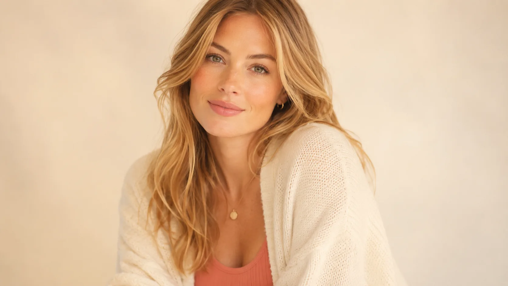
These warm, light, clear colors echo your natural softness and bring out the warmth in your skin and eyes.
Understanding the Light Spring Color Palette
Light Spring runs on one gentle rule: warmth without weight. Every color here is light, warm, and clear. Warm peach, apricot, butter yellow, spring green: like a garden caught in early, soft morning light. Nothing is dark, and nothing is muddy.
Lightness and low contrast are what separate Light Spring from True Spring and Bright Spring. All three share warmth, but Light Spring's colors sit at the palest, gentlest end of the family. Think warm peach instead of true coral, butter yellow instead of golden yellow.
Because the palette is defined by lightness, the easiest way to get it wrong is reaching for anything dark or stark. A black blazer or a charcoal coat doesn't read as a grounding neutral on Light Spring. It reads as overpowering, since nothing else in the coloring supports that level of depth.
Light Spring Signature Colors
8 signature colors from the Light Spring palette, spanning soft neutrals to bold statement shades.
Want your personalized top matches + AI-styled outfit photos? Get your full report →
Light Spring Worst Colors
These colors fight the two things that define Light Spring: warmth and lightness. Each one below fails for its own specific reason.
Pure White (stark)
Stark white is too harsh and high-contrast for Light Spring's soft, low-contrast coloring. Warm ivory does the same job without the starkness.
Cool Grey
A neutral, cool grey has no warmth at all, so it reads as flat and lifeless against Light Spring's naturally warm, radiant coloring.
Black
Pure black is both too dark and too cool for this light, warm palette. It overwhelms delicate features instead of framing them.
Hot Pink
A cool-leaning, high-saturation pink is both too intense and too cool for Light Spring's soft, warm chroma.
Royal Blue
A true, saturated cool blue has no place in a warm, light palette. There's no way to make it read as soft or golden.
Burgundy
Burgundy is both too dark and too cool-based for Light Spring's light, warm register. It reads as heavy rather than rich.
Charcoal
Charcoal is a cool, dark neutral that overwhelms Light Spring's naturally light coloring the same way black does.
Deep Plum
A deep, cool purple is far too dark and too cool for this palette's light warmth.
Cool Teal
A cool teal has none of the warm, aqua quality Light Spring's own turquoise-adjacent colors carry. It reads as chilly rather than fresh.
Stark Navy
Stark navy is dark and distinctly cool, clashing with both the lightness and the warmth that define this palette.
Building a Light Spring Capsule Wardrobe
Light Spring's capsule is built around 8 tops and 5 light, warm neutrals that all share the same soft, radiant register, so anything from the tops list pairs correctly with anything from the bottoms list.
Tops
Bottoms
Outfit Ideas
- —Soft Coral top + Warm Ivory trousers: the quintessential Light Spring combination, warm and luminous without needing a third color.
- —Warm Aqua top + Light Warm Tan bottoms: a fresh, gentle pairing that keeps the whole look light.
- —Spring Green layered over Warm Ivory: a soft, garden-fresh combination that reads put-together rather than plain.
- —Butter Yellow as the statement piece against Soft Caramel or Light Warm Tan. Yellow is one of the palette's brightest notes, so it works best as the one lifted piece in an otherwise soft outfit.
Light Spring Color Combinations
Both colors in these pairings sit at the same light, warm register. Nothing in a Light Spring combination should read as darker or cooler than its partner.
Warm Peach + Warm Aqua
A classic Light Spring pairing: warm peach against a warm-leaning aqua, both light enough that neither overwhelms the other.
Soft Coral + Spring Green
A garden-fresh combination that captures the palette's identity at a glance.
Light Gold + Blush
A soft, luminous pairing ideal for daytime. Both colors sit at the same gentle depth.
Soft Caramel + Wisteria
Wisteria is the coolest-reading color in the palette, but its softness keeps it comfortably paired with caramel rather than clashing.
Light Spring Wardrobe and Style
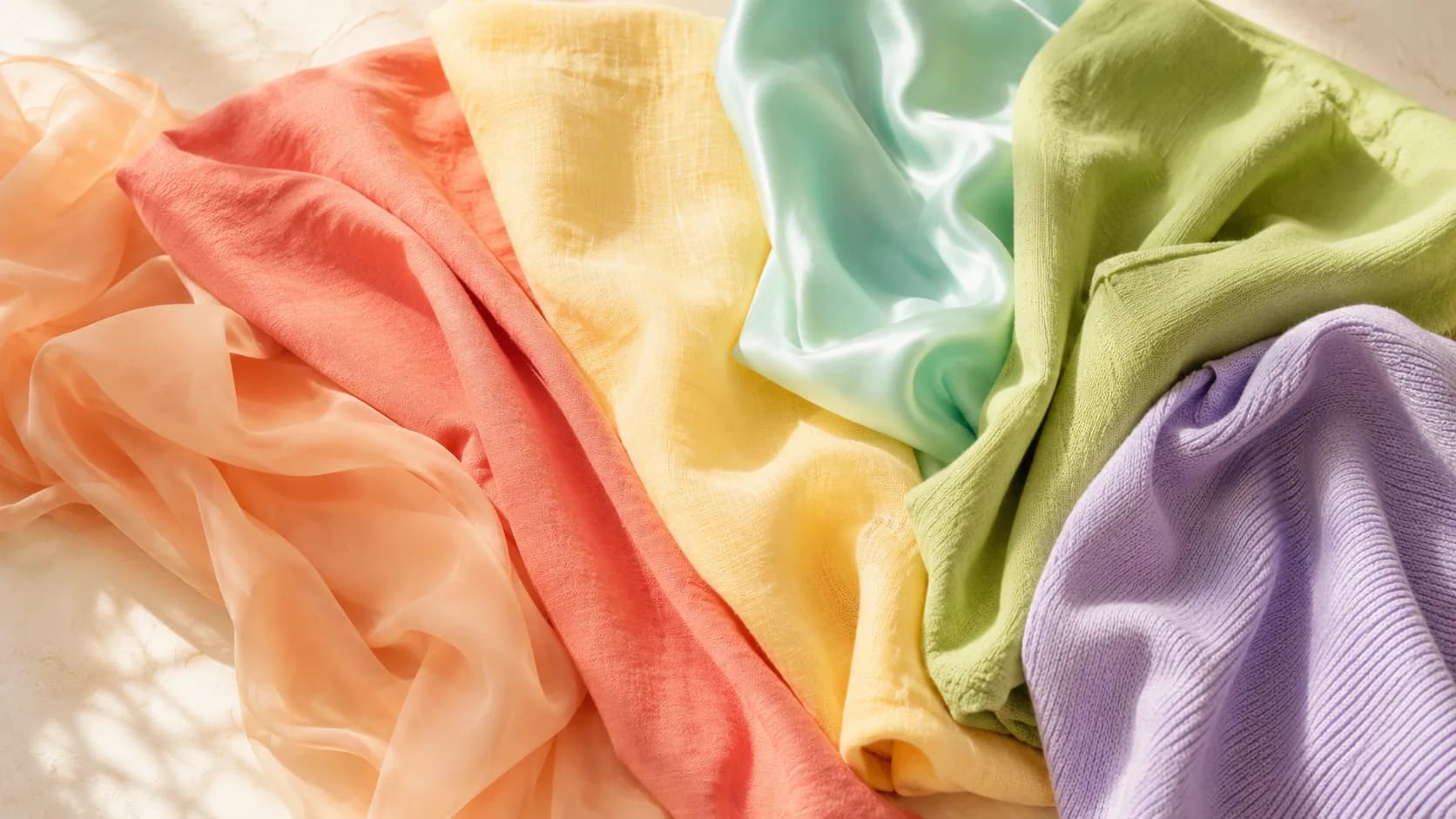
Shop by weight as much as by color. Light Spring reads correctly in lightweight cottons, chiffon, and soft knits, while anything heavy or structured works against the palette regardless of the exact shade. A warm ivory blouse or a soft caramel cardigan will almost always sit correctly in this palette, even without a perfect hex match.
Core Neutrals
Statement Colors
Light Spring Hair Color Guide
At the salon, ask for warm, light tones and avoid anything labeled "ash" or "cool." A colorist defaulting to trendy ash-blonde or cool balayage works against Light Spring's warm glow. Pale golden blonde highlights woven through a warm honey blonde base read as sun-kissed dimension rather than departure. Keep contrast low between base and highlights. Light Spring's own low natural contrast is flattered by soft, blended color rather than chunky, high-contrast pieces.
Light Spring Makeup Guide
Light Spring makeup should stay as light-handed as the palette itself. A heavy, matte, full-coverage look reads as borrowed from a deeper season. Sheer and dewy finishes suit this palette better than matte, and a soft coral or peach lip paired with a light golden-brown eye is usually enough on its own. Building too much intensity into any one feature fights the delicacy that defines Light Spring.
Your personalized report includes a complete makeup breakdown tailored to your specific color profile.
Prints and Patterns for Light Spring
Light Spring's low contrast and light, clear chroma mean prints need to stay soft and light-value. A pattern with any black, navy, or other dark anchor color will look like it belongs to a deeper, cooler season.
Small floral prints in warm pastels work naturally here, think warm peach blooms on a butter-yellow ground, since the scale and lightness both match the coloring.
Keep pattern scale small to medium. Light Spring's delicacy is overwhelmed by bold, large-scale prints the same way it's overwhelmed by dark solid colors.
Avoid high-contrast prints. A black-and-white check or navy-and-white stripe both introduce more darkness and coolness than this palette can carry.
Wearing Light Spring Year-Round
Light Spring's palette translates easily across seasons because it's defined by lightness and warmth, not by weight. The same warm peach and spring green that work in a summer sundress also work in lighter-weight knits for cooler months.
For colder months, lean into the palette's warm neutrals (warm ivory, light warm tan, soft caramel) in slightly heavier but still light-toned fabrics. Skip the temptation to switch to black or charcoal just because it's winter.
For warmer months, the brighter accent colors (soft coral, butter yellow, warm aqua) shine in lightweight cottons and linens, which is where this palette feels most natural.
Light Spring Jewelry: Light, Warm Metals
Light Spring's warm undertone favors light gold, rose gold, and warm-toned mixed metals over heavy yellow gold or silver. Anything too dark or too cool disrupts the palette's delicate quality. Delicate, fine jewelry suits this palette better than chunky statement pieces, echoing the lightness of the clothing palette itself.
Shopping for Light Spring on a Budget
Start with one warm neutral, warm ivory or light warm tan, for a cardigan or trousers, since these are easy to find at any price point. Add one or two of the brighter accent colors (soft coral or spring green) in something small first, a scarf, a top, before investing in harder-to-find shades like wisteria or dusty mint.
Frequently Asked Questions
Ash Blonde is the main color to avoid. It fights Light Spring's warm undertone the same way a cool grey or navy would in clothing. Light Spring hair looks best in Warm Honey Blonde as a base, with Pale Golden Blonde highlights and Light Warm Brown lowlights: all light, all warm.
The core palette includes Warm Peach, Apricot, Soft Coral, Golden Cream, Warm Pink, Light Gold, Peachy Nude, Warm Aqua, Light Periwinkle, Soft Caramel, Spring Green, and Butter Yellow. Warm Ivory, Melon, Blush, Light Warm Tan, Wisteria, Dusty Mint, Warm Champagne, and Rose Gold round out the full 20-color set.
Not well. Pure black is too dark and too cool for this light, low-contrast palette. Warm Ivory or Light Warm Tan do the job of a neutral without the overwhelming weight.
Want the traits behind this palette? Read the full Light Spring Color Analysis →
Are you a Light Spring?
Take our free 3-minute quiz to find your exact color season — no email required.
Find My Season →