Soft Autumn Color Palette
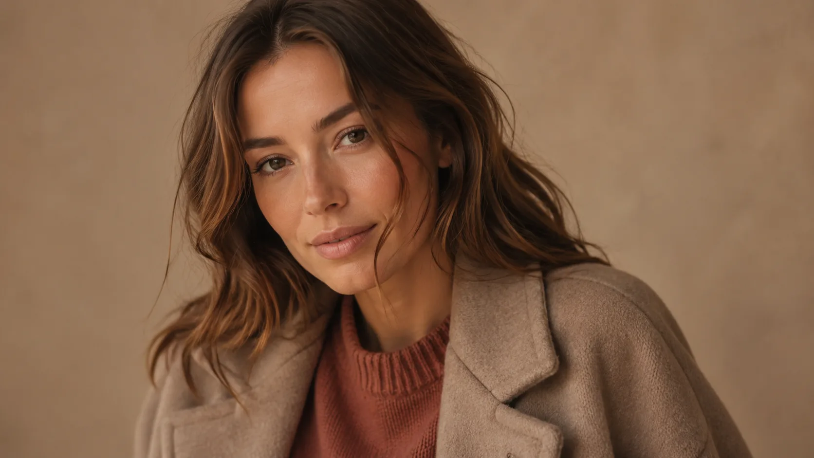
Warm, earthy, and softly muted — these tones harmonize with your gentle warm undertone without overwhelming your soft coloring.
Understanding the Soft Autumn Color Palette
Soft Autumn runs on one quiet rule: warmth without intensity. Every color here is warm-neutral and muted. Camel, dusty terracotta, warm sage, soft copper: it's as if the entire palette has been seen through a light haze. Nothing shouts, and everything blends.
Chroma and contrast are what separate Soft Autumn from True Autumn and Deep Autumn, not warmth. All three share the same warm undertone, but Soft Autumn's colors are the softest, most low-contrast version of it. Think dusty rose instead of warm burgundy, muted gold instead of autumn gold.
Because softness defines this palette, the easiest way to get it wrong is reaching for anything too saturated or too stark. A pure white blouse or a hot pink accent doesn't register as a bold contrast on Soft Autumn. It just reads as jarring, since nothing else in the coloring supports that level of intensity.
Soft Autumn Signature Colors
8 signature colors from the Soft Autumn palette, spanning soft neutrals to bold statement shades.
Want your personalized top matches + AI-styled outfit photos? Get your full report →
Soft Autumn Worst Colors
It's not that these colors are simply "not your colors." They actively fight the two things that define you: warmth and softness. Each one below fails for its own specific reason.
Pure White
Stark white has none of the warmth or gentleness this palette needs. It creates a harsh, high-contrast look completely at odds with Soft Autumn's naturally low-contrast coloring.
Black
Pure black reads both too cool and too high-contrast for Soft Autumn's muted warmth. It overwhelms soft features instead of framing them.
Icy Blue
A cool, pale blue has no warmth at all, so it reads as washed-out and slightly sickly against warm-neutral skin rather than as a soft complement.
Bright Pink
This saturated, cool-leaning pink is both too bright and too cool for Soft Autumn's soft, warm chroma. It looks synthetic next to the palette's dusty, natural tones.
Cool Purple
A bright, cool-based purple clashes with Soft Autumn's warm undertone and runs far too saturated for a palette built on muted, gentle color.
Electric Blue
A highly saturated, cool blue clashes with Soft Autumn's warm undertone and runs far too intense for a palette built on gentle, muted color.
Neon Yellow
Neon brightness has no place in a muted palette. Even Soft Autumn's own gold and khaki tones are dusty, never electric.
Hot Pink
Hot Pink differs from Bright Pink only in exact shade, and shares the same problem: too cool and too saturated for Soft Autumn's soft warmth.
Building a Soft Autumn Capsule Wardrobe
A capsule wardrobe works because every piece is chosen to combine with every other piece. Soft Autumn's capsule is built around 8 tops and 5 warm, muted neutrals that share the same gentle depth, so anything from the tops list pairs correctly with anything from the bottoms list.
Tops
Bottoms
Outfit Ideas
- —Dusty Terracotta top + Camel trousers: the quintessential Soft Autumn pairing, warm and understated without needing a third color.
- —Soft Olive top + Warm Greige bottoms: a quiet, tonal combination that lets the softness of both colors do the work.
- —Warm Sage layered over Warm Beige: a gentle, low-contrast pairing that reads calm rather than plain.
- —Soft Copper as the statement piece against Warm Cream or Camel. Copper is one of the palette's richer notes, so it works best as the one slightly bolder item in an otherwise muted outfit.
Soft Autumn Color Combinations
Both colors in these pairings sit at the same soft, warm register. Nothing in a Soft Autumn combination should read as more saturated or cooler than its partner.
Dusty Terracotta + Warm Sage
A classic Soft Autumn pairing: warm dusty pink-orange against a muted warm green, both equally gentle so neither fights for attention.
Muted Gold + Bronze
Two warm metallics in fabric form. Layering these reads as rich without ever feeling loud.
Camel + Dusty Rose
A soft neutral-plus-accent formula, ideal for anyone easing into color after wearing mostly neutrals.
Soft Copper + Warm Greige
Copper is the boldest color in this pairing, but greige's warmth keeps it grounded rather than showy.
Soft Autumn Wardrobe and Style
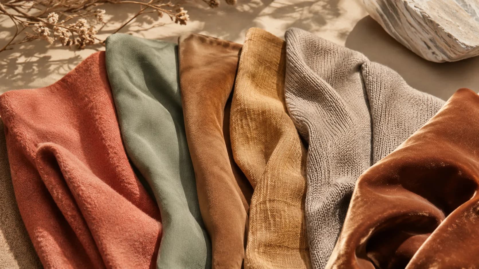
Because Soft Autumn is defined by softness rather than a specific fabric weight, shop by finish as much as by color. Brushed cotton, suede, and matte wool all read correctly, while anything glossy, sequinned, or patent works against the palette regardless of its exact shade. A warm greige knit or a camel suede jacket will almost always sit correctly in this palette, even without a perfect hex match.
Core Neutrals
Statement Colors
Soft Autumn Hair Color Guide
At the salon, ask for warm-neutral, low-contrast tones and steer clear of anything described as "ash" or "cool." A stylist defaulting to trendy cool-toned balayage will work against Soft Autumn's gentle warmth. Warm beige blonde highlights placed subtly through a warm ash brown base read as dimension rather than a departure from the palette. High-contrast color placement, chunky, stark highlights, works against you here. Soft Autumn's low natural contrast is flattered by soft, blended transitions instead.
Soft Autumn Makeup Guide
Soft Autumn makeup works best when the whole face stays in the same soft register. A single bold element, a saturated lip, a sharp liner, will look like it belongs to a different, higher-contrast season. Cream and satin finishes suit this palette better than anything high-shimmer or matte-stark, since they echo the softness already in the clothing palette. Build color gradually: a soft terracotta-rose lip and a warm taupe eye together read as finished, not underdone.
Your personalized report includes a complete makeup breakdown tailored to your specific color profile.
Prints and Patterns for Soft Autumn
Soft Autumn's low contrast and muted chroma mean prints need to stay tonal. A pattern built from high-contrast or highly saturated colors will look like it belongs to a different, bolder season.
Small-to-medium florals in muted, warm colorways work naturally here, dusty terracotta blooms on a warm cream ground, for instance, since the softness of the print matches the softness of the coloring.
Herringbone, subtle plaid, and other low-contrast woven textures suit Soft Autumn better than anything bold or graphic. The visual interest comes from texture, not stark contrast.
Avoid prints that pair pure white or black with bright color. A red-and-white gingham or black-and-gold pattern both introduce more contrast and saturation than this palette can carry.
Wearing Soft Autumn Year-Round
Soft Autumn's muted warmth works in any season because it's defined by tone, not weight. The same dusty terracotta and warm sage that read as autumnal in wool also work in linen and cotton for summer.
For colder months, lean into the palette's neutrals, camel, warm greige, warm beige, as coats and knitwear, since they carry the season's identity without needing bold color.
For warmer months, the softer accent colors (dusty salmon, dusty rose, soft olive) translate easily into lightweight blouses and dresses, keeping the same muted warmth without the heavier fabric.
Soft Autumn Jewelry: Warm, Muted Metals
Soft Autumn's warm-neutral undertone favors muted gold, brushed bronze, and rose gold over bright yellow gold or silver. Anything too shiny or too cool disrupts the palette's gentle quality. Brushed or matte finishes work better than high-polish, mirroring the softness of the clothing palette itself.
Shopping for Soft Autumn on a Budget
Start with one warm neutral, camel or warm greige, for a coat or trousers, since these are the easiest Soft Autumn colors to find at any price point. Add one or two of the softer accent colors (dusty terracotta or warm sage) in something small first, a scarf, a knit top, before investing in harder-to-find shades like soft copper or muted gold.
Frequently Asked Questions
Cool Ash Blonde is the main color to avoid. It fights Soft Autumn's warm-neutral undertone the same way an icy blue or bright pink would in clothing. Soft Autumn hair looks best in Warm Ash Brown as a base, with Warm Beige Blonde highlights and Warm Medium Brown lowlights: all gentle, all warm.
The core palette includes Warm Beige, Camel, Dusty Terracotta, Muted Gold, Soft Olive, Dusty Salmon, Warm Cream, Warm Greige, Bronze, Dusty Rose, Warm Sage, and Soft Copper. Warm Khaki, Muted Brick, Dusty Peach, and Tan round out the full 16-color set. Every shade shares the same warm-neutral undertone and soft, muted saturation.
Not well. Pure black is too stark and too cool for this palette's low-contrast softness. Warm Greige or a deep camel-brown does the job of a dark neutral without the harsh contrast.
Want the traits behind this palette? Read the full Soft Autumn Color Analysis →
Are you a Soft Autumn?
Take our free 3-minute quiz to find your exact color season — no email required.
Find My Season →