Deep Autumn Color Palette
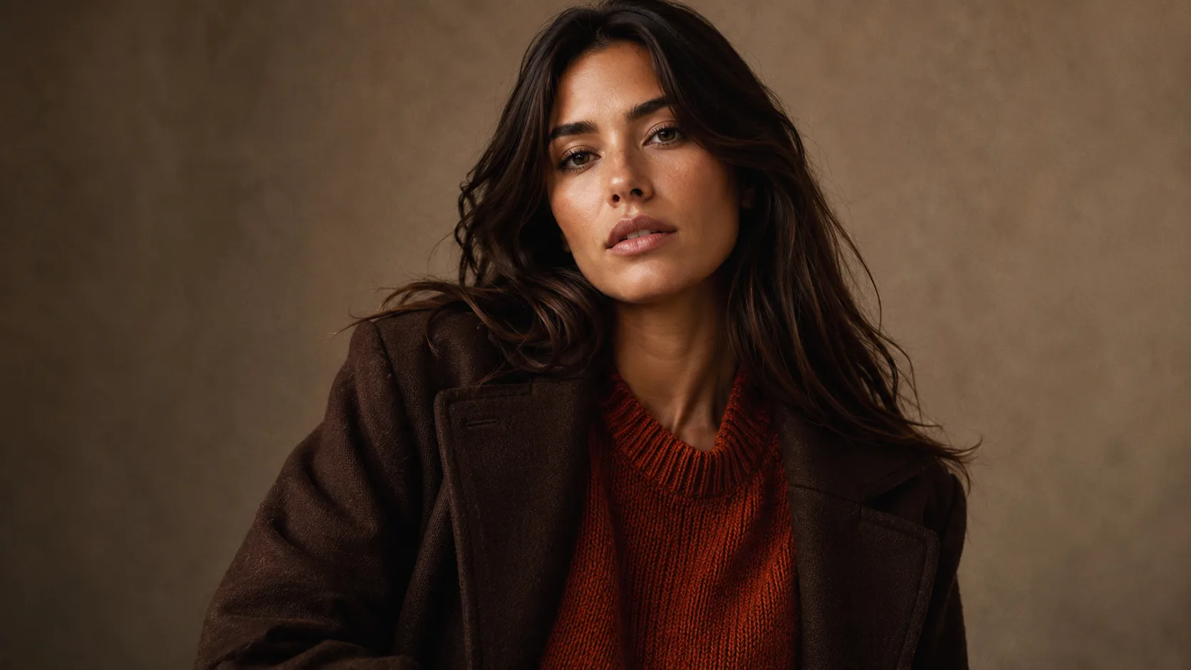
Deep, warm, and richly saturated, plus a few warm light shades. These colors match the weight and warmth of your naturally deep coloring.
Understanding the Deep Autumn Color Palette
Deep Autumn runs on one rule above everything else: stay warm, stay rich. Most of the palette carries real depth, from Deep Orange and Dark Warm Red to Deep Teal and Dark Olive. If a shade would look at home in a spice market, or in an autumn forest right as the light starts fading, it's probably here.
Depth is what separates Deep Autumn from the rest of the family, not warmth. True Autumn and Soft Autumn are warm too, but neither carries this much saturation or darkness. Picture True Autumn's colors pushed a register darker and richer: orange becomes Deep Orange, olive turns into Dark Olive, red deepens into Dark Warm Red.
Deep doesn't mean dark-only, though. The palette also has lighter warm colors, like Blooming Dahlia, Pastel Lavender and White Swan, which work best next to the deep ones rather than on their own. What doesn't work is icy or cool pastels: an icy blue or a cold pink has none of the warmth your coloring needs.
Deep Autumn Signature Colors
8 signature colors from the Deep Autumn palette, spanning soft neutrals to bold statement shades.
Want your personalized top matches + AI-styled outfit photos? Get your full report →
Deep Autumn Worst Colors
These colors don't just clash with Deep Autumn. They actively work against the two things that define you: warmth and depth. Every one below fails for its own specific reason.
Icy Blue
Icy blue has no warmth at all. Deep Autumn can wear some lighter colors, but they need to be warm, like Blooming Dahlia or White Swan, not icy.
Pure White
Stark white skips both warmth and depth, the two qualities this whole palette runs on. What you get is a harsh, flat contrast instead of the soft-but-deep look that actually works.
Cool Grey
A cool, neutral grey has no warmth at all, so it reads as dull and lifeless against deep warm coloring. Even greige needs a visible warm cast to work here; true cool grey just doesn't have it.
Hot Pink
This cool-leaning, high-saturation pink has none of the earthy warmth Deep Autumn needs. It clashes with warm undertones instead of harmonizing, landing as jarring rather than vibrant.
Royal Blue
A true cool blue has no place in a warm palette. There's no way to make it read as earthy or rich, and it sits at the opposite end of the color wheel from everything else in this lineup.
Cool Purple
Bright, cool-based purple is both too cool and too saturated for Deep Autumn's muted-but-deep chroma. It looks synthetic next to the palette's natural, earthy tones.
Building a Deep Autumn Capsule Wardrobe
A capsule wardrobe works because every piece is chosen to combine with every other piece. Deep Autumn's version is built around 8 tops and 5 grounding neutrals, all sharing the same warm, deep register. Nothing needs careful matching: anything from the tops list pairs correctly with anything from the bottoms list.
Tops
Bottoms
Outfit Ideas
- —Deep Orange top + Dark Chocolate trousers: the classic Deep Autumn combination, rich and warm without needing a third color.
- —Deep Teal top + Dark Olive bottoms: two deep colors that stay calm together.
- —Dark Warm Red layered over Dark Taupe: a warm red against a soft dark neutral, polished enough for work.
- —Deep Mustard as the statement piece against Dark Chocolate or Military Olive. It's one of the palette's brightest notes, so keep it to one piece.
Deep Autumn Color Combinations
Every color in these pairings is warm. Most sit at the same depth, and where one is lighter, it's a warm light color like White Swan or Blooming Dahlia, never an icy one.
Deep Orange + Deep Teal
The classic Deep Autumn pairing: a burnt orange against a deep warm teal, both equally rich.
Dark Chocolate + Blooming Dahlia
A deep brown with a soft warm coral. The coral lifts the brown without leaving the warm family.
Dark Warm Red + White Swan
White Swan is the palette's light neutral. Use it wherever you'd reach for white.
Rosé Sorbet + Titan Blue
A berry pink with a deep blue-grey. A cooler-reading pairing that still sits inside the palette.
Deep Autumn Wardrobe and Style
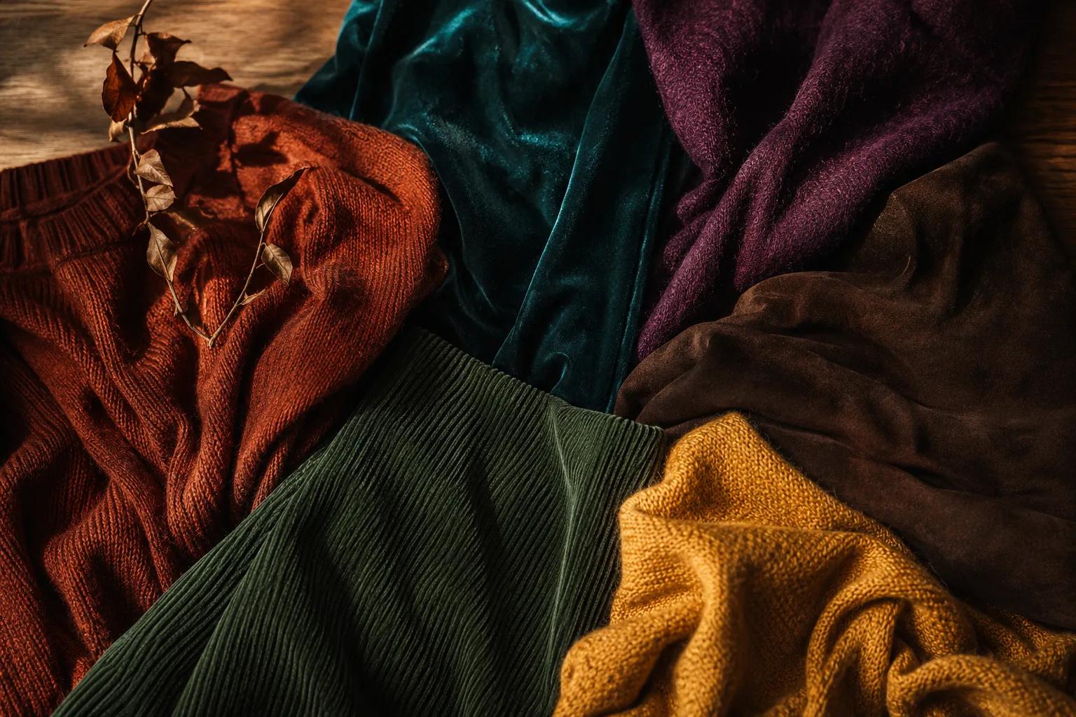
The fastest way to build this wardrobe on a budget is to shop by fabric weight and finish before you worry about exact shade. A warm-toned wool coat, a rust corduroy jacket, or a deep brown leather bag will almost always sit correctly in this palette even without a perfect hex match, because matte, warm, textured fabrics read as "Deep Autumn" on sight. Skip glossy, cool-finish fabrics like patent leather or shiny synthetics, even in an otherwise-correct color. The sheen itself reads cooler than the palette can support.
Core Neutrals
Statement Colors
Deep Autumn Hair Color Guide
Translating this into a salon conversation: ask specifically for warm, gold-based tones, and rule out ash or cool-toned formulas up front. A colorist unfamiliar with seasonal color analysis will often default to whatever's trending, which lately skews toward cool, ashy blondes, the opposite of what Deep Autumn needs. Warm copper or auburn lowlights, placed close to the natural warm-brown base, read as dimension rather than a departure from the palette. Going lighter? Stop at a deep warm caramel rather than reaching for anything blonde. Deep Autumn's depth doesn't support pale hair any more than it supports pale clothing.
Deep Autumn Makeup Guide
Beyond shade selection, Deep Autumn makeup comes down to matching intensity, not just warmth. A sheer, light-handed lip in the right rust tone can still look wrong if it's too soft for this palette's natural richness. Cream and matte textures generally outperform frosted or icy finishes, since shimmer with a cool base fights the same warmth the color is trying to deliver. When building a full face, anchor with one deep, warm base first, a bronze eye or warm brown liner, before adding the statement lip or blush. Trying to make every element equally bold at once usually backfires.
Your personalized report includes a complete makeup breakdown tailored to your specific color profile.
Prints and Patterns for Deep Autumn
Deep Autumn's high contrast and depth mean prints need real contrast between their own colors. A pattern where every color sits at the same muted-medium depth reads as flat and muddy rather than rich.
Animal prints work naturally here: leopard and tortoiseshell are built from the same warm browns and rusts already in the palette. Plaid and tartan in rust, forest, and mustard read as an extension of the wardrobe rather than a departure from it.
Keep pattern scale medium to large. Deep Autumn's saturation and depth overwhelm small, delicate prints the same way they overwhelm pale solid colors. A tiny ditsy floral disappears; a bold paisley or wide plaid holds its own.
Avoid prints built on cool or pastel color combinations. A plaid that mixes icy blue with grey fights the palette's warmth no matter how well-balanced the pattern itself is.
Wearing Deep Autumn Year-Round
Deep Autumn's palette works especially well in the colder months. Its rich depth pairs naturally with heavier fabrics: wool, suede, corduroy, leather. A Dark Chocolate coat or a Deep Orange sweater is this palette at its most effortless.
For warmer months, lean on the palette's lighter colors and lighter fabrics. Blooming Dahlia, White Swan and Smoke Grey work in linen or cotton, and a Deep Teal or Deep Orange top in a light fabric still feels right for summer.
For year-round layering, keep the darker neutrals (Dark Chocolate, Dark Olive, Dark Taupe) as a base wardrobe, and rotate the palette's more saturated colors (Deep Orange, Deep Mustard, Deep Teal) as the accent piece that changes with the weather.
Deep Autumn Jewelry: Gold, Not Silver
Deep Autumn is a warm season, so gold in any form, yellow gold, antique gold, bronze, copper, reads as an extension of the skin's natural warmth. Silver and white metals just sit coolly on top instead of blending in. Antique or brushed gold finishes work especially well, since Deep Autumn's palette already favors depth over shine. If you gravitate toward mixed metals, lead with gold and let silver play a supporting role at most.
Shopping for Deep Autumn on a Budget
You don't need twenty new pieces to build this palette. You need the right five or six. Start with one deep neutral, Dark Chocolate or Dark Olive, for a jacket or trousers, since neutrals get the most wear and are easiest to find secondhand. Add one or two statement colors (Deep Orange or Deep Mustard) in something small and inexpensive first, a scarf, a top, earrings, before committing to full-price pieces in harder-to-find shades like Deep Teal or Rosé Sorbet.
Frequently Asked Questions
Cool Black and any ashy, cool-toned shade work against Deep Autumn's warm undertone. Deep Autumn hair looks best in Deep Warm Brown as a base, with Dark Copper highlights and Near-Black Warm lowlights: all warm, all deep. A flat, blue-black or platinum-ash color creates the same undertone clash as wearing Royal Blue or Cool Grey.
The core palette is Deep Orange, Dark Chocolate, Blooming Dahlia, Deep Teal, Deep Mustard, Dark Warm Red, Rosé Sorbet, White Swan, Dark Forest, Elephant Grey, Titan Blue, and Dark Olive. Warm Aubergine, Dark Copper, Smoke Grey, Dark Taupe, Cranberry, Plantation Olive, Sunburn, Jungle Green, Willow, Latte, Military Olive, and Pastel Lavender round out the full 24-color set.
Not pure black. It's too cool and stark, with none of the warmth this palette needs. Dark Chocolate or Jungle Green does the job pure black would do elsewhere: a deep, grounding neutral that still reads as warm.
Want the traits behind this palette? Read the full Deep Autumn Color Analysis →
Are you a Deep Autumn?
Take our free 3-minute quiz to find your exact color season — no email required.
Find My Season →