Spring Color Palette
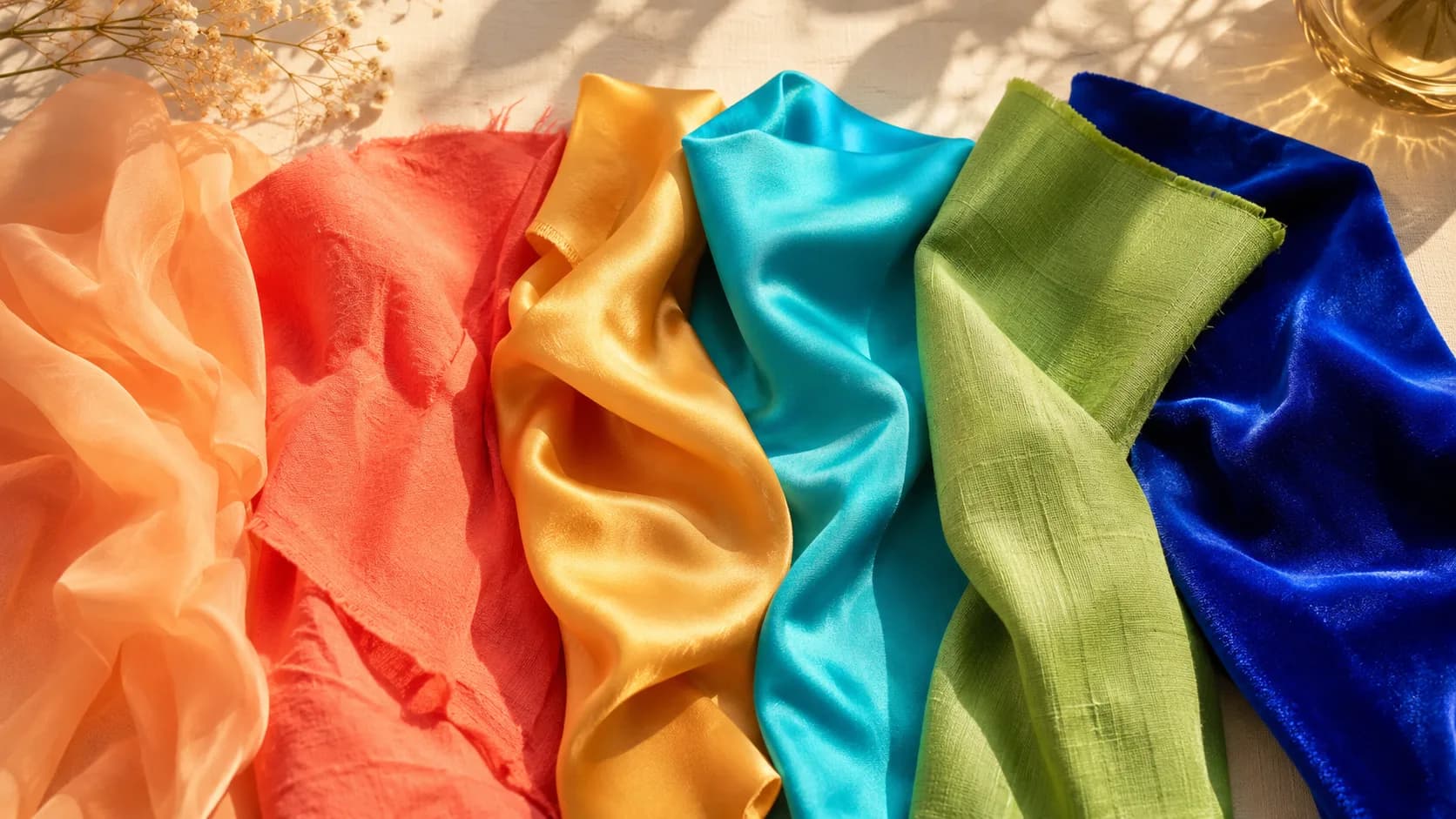
These colors span the Spring family — from Light Spring's softest peaches to Bright Spring's vivid corals. All share the warmth that defines the family: golden undertones, peachy bases, and warm aquas that glow against Spring skin.
Understanding the Spring Color Palette
Spring is built on one shared foundation: warmth with clarity. Every color across all four Spring sub-seasons carries a golden, peachy base and a clean, non-muddy quality. Even at Bright Spring's most intense or Clear Spring's most vivid, nothing in the Spring family is dusty or muted.
What separates the four Spring sub-seasons is how much of that warmth is paired with lightness versus saturation. Light Spring keeps the palette pale and gentle. True Spring sits in a balanced middle. Bright Spring and Clear Spring push chroma to its highest setting, with Clear Spring alone comfortable stepping slightly toward neutral or cool-leaning brights.
The word most often misunderstood about "spring colors" is softness. Most people picture only pastels. The actual Spring family is just as much about vivid coral and electric turquoise as it is about warm peach, as long as the color stays warm and clear rather than cool or muted.

Spring Family Signature Colors
Colors pulled from all four Spring sub-seasons, Light, True, Bright, and Clear, spanning the family's full range from soft warm peaches to electric warm brights.
Want your exact Spring sub-season match + personalized styling? Get your full report →
Colors the Spring Family Should Avoid
Every Spring sub-season fails the same way: coolness and mutedness. Charcoal, navy, burgundy, mauve, and any dusty, greyed-down color all look flat or sallow against Spring's warm, clear coloring, the opposite of the fresh, radiant effect that makes Spring distinctive. Even within warm colors, muted or dusty versions (dusty rose instead of true coral, sage instead of spring green) underserve Spring the way they'd suit Autumn instead. See each sub-season's own palette page, Light Spring, True Spring, Bright Spring, Clear Spring, for the specific worst-colors list tied to your exact depth and chroma level.
The 4 Sub-Seasons
All share the same family undertone, but each occupies its own place on the depth and chroma spectrum.
Light Spring
Warm, light & delicate
Lightest depth · Softest chroma · Low contrast
True Spring
The balanced warm classic
Medium depth · Clear chroma · Medium contrast
Bright Spring
Vivid, punchy & high-contrast
Medium depth · Bright chroma · High contrast
Clear Spring
Warm clarity with a bold edge
Medium depth · Bright chroma · High contrast — borders Winter
Spring Family Color Combinations
Spring's defining trait is warmth-with-clarity, so these pairings work by keeping every color clean and non-muted. Nothing dusty or cool enters the mix, even when combining colors from different Spring sub-seasons.
Warm Peach + True Coral
A gentle-to-vivid gradient within the same warm family. Proof that Light Spring's softest peach and True Spring's boldest coral share the same underlying warmth.
Golden Yellow + Bright Turquoise
True Spring's warm gold against Bright Spring's vivid turquoise: a lively, sunny pairing that spans two sub-seasons without clashing.
Warm Ivory + Clear Cobalt
A cross-family pairing that shows Spring's range. Ivory keeps things warm while cobalt, borrowed from Clear Spring's cooler-neutral edge, adds a crisp, modern contrast.
Spring Green + Bright Coral
A fresh, garden-to-vivid pairing that captures Spring's full energy in one combination.
Prints and Patterns for the Spring Family
Every Spring sub-season shares the same rule for prints: keep the colors within the pattern warm and clear, never muted or cool, regardless of how light or bold the print itself is.
Florals suit Spring better than almost any other family. The trick is matching scale and saturation to your specific sub-season. Light Spring wears small, pale florals; True and Bright Spring can carry medium-to-large florals in fully saturated warm colors; Clear Spring does best with clean, high-contrast prints rather than soft watercolor ones.
The one hard rule across all four: avoid any print that mixes in mutedness. A floral with dusty sage or greige undermines the same clarity a solid muted color would.
Wearing the Spring Palette Year-Round
Spring's warm, clear palette naturally suits the warmer months. Its lightweight, fresh energy is easy to translate into cotton and linen for spring and summer wear.
For colder months, Spring's warm neutrals (warm ivory, camel, warm tan) and richer accent colors (warm emerald, bright orange) work just as well in heavier fabrics without needing to switch to Spring's colder-season opposites (navy, charcoal, burgundy).
For year-round basics, Spring's warm neutrals do double duty in any season, leaving the sub-season-specific accent color as the element that changes with the occasion rather than the wardrobe foundation.
Spring Jewelry: Warm Metals Across the Board
Every Spring sub-season shares a warm undertone (Clear Spring is the one partial exception, comfortable in both warm and cool metals), so gold, in whichever finish matches your specific sub-season's depth, from light rose gold for Light Spring to bright polished gold for Bright Spring, reads as an extension of the skin's natural warmth. Silver generally sits coolly on top instead of blending in, except for Clear Spring, where clean, bright silver can work as well as gold.
Shopping the Spring Palette on a Budget
Spring's core neutrals, warm ivory, camel, warm tan, are easy to find in any store at any price point, so build the wardrobe foundation there first. Save the budget for the harder-to-find, more saturated accent colors (true coral, bright turquoise, electric violet) in one or two higher-visibility pieces. A single well-chosen vivid piece does more for a Spring's coloring than five muted or cool-toned ones ever will.
Frequently Asked Questions
Start with the shared family neutrals, warm ivory, camel, warm tan, plus one warm, medium-saturation accent color like coral or warm emerald, which reads correctly across all four Spring sub-seasons. Take the free quiz for an exact match and the full palette tailored to your specific depth and chroma.
The core warm, clear identity is the same across all three systems. 4-season, 12-season, and this 16-season system just add more precision. The 4-season system has one broad Spring; the 12-season system usually splits it into three; this 16-season system splits it into four (Light, True, Bright, Clear) by tracking depth and chroma separately rather than blending them into one axis.
Skin tone is a strong starting signal for Spring, but it's not the whole picture — hair and eye coloring matter too. A warm, golden or peachy undertone with a clear rather than dusty quality points toward Spring. From there, how light or saturated your overall coloring is splits you into Light, True, Bright, or Clear. Take the free quiz for an exact match instead of guessing from skin tone alone.
Want the full breakdown by sub-season? Read the full Spring Color Analysis →
Are you a Spring?
Take our free 3-minute quiz to find your exact color season — no email required.
Find My Season →