Clear Spring Color Palette
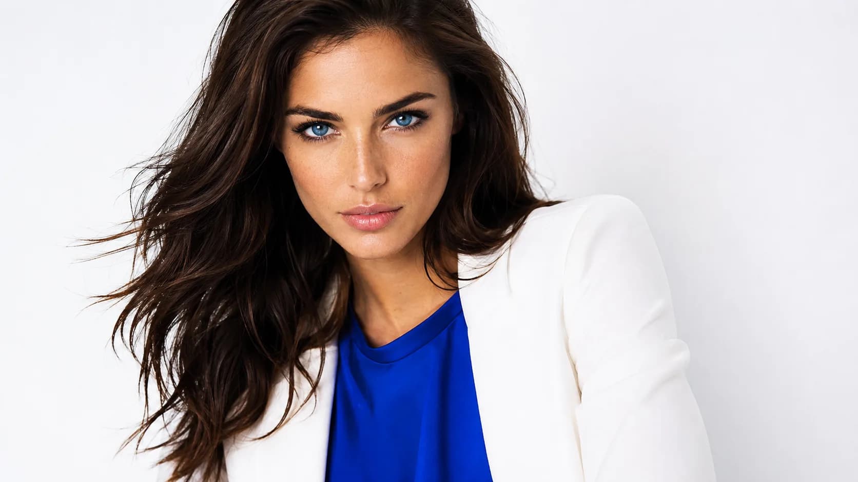
Vivid, clear, and high-intensity — these colors match the striking clarity of your eyes and overall coloring.
Understanding the Clear Spring Color Palette
Clear Spring is defined by one rule above all else: clarity. Bright aqua, clear pink, electric green. Every color here is vivid, saturated, and clean, whether it leans warm or cool. This is the bridge between Bright Spring and Bright Winter, and it shows: the palette doesn't commit fully to warm or cool, but it never compromises on brightness.
Temperature neutrality is what separates Clear Spring from Bright Spring. Bright Spring is warm-and-bright; Clear Spring is neutral-and-bright, comfortably wearing both a deep marine blue and a hot coral as long as both stay clear.
Because the palette is defined by clarity, the easiest way to get it wrong is reaching for a muted or dusty color, regardless of temperature. A soft mauve top doesn't read as a quiet accent on Clear Spring; it reads as dull. Neutrals are different: soft ones like Summer Sand or Silver Lining work well, as long as the colors you pair them with stay bright.
Clear Spring Signature Colors
8 signature colors from the Clear Spring palette, spanning soft neutrals to bold statement shades.
Want your personalized top matches + AI-styled outfit photos? Get your full report →
Clear Spring Worst Colors
The colors that hurt a Clear Spring palette fight the one thing that defines you: clarity. Each one below fails for its own specific reason.
Muted Sage
Muted sage has none of the vividness Clear Spring needs. It reads as flat and tired against such clear, striking natural coloring.
Dusty Rose
Dusty rose is muted and muddy, the opposite of the clean, saturated pink tones that actually work on Clear Spring.
Warm Beige
Warm beige is too muted and too warm-leaning for this neutral, high-clarity palette. It reads as dull rather than as a clean neutral.
Soft Mauve
Soft mauve is muted and murky. It fights the clarity that defines every other color in this palette.
Building a Clear Spring Capsule Wardrobe
Clear Spring's capsule is built around 8 tops and 5 clear, high-clarity neutrals that all share the same vivid register, so anything from the tops list pairs correctly with anything from the bottoms list.
Tops
Bottoms
Outfit Ideas
- —Bright Aqua top + Pure White trousers: the classic Clear Spring combination, crisp and light without needing a third color.
- —Hot Coral top + Silver Lining bottoms: a soft grey-beige grounds the coral without dulling it.
- —Clear Pink layered over Deep Marine Blue: the navy gives the pink something to stand against, which suits this palette's contrast.
- —Yellow-Green as the statement piece against Pure White or Summer Sand. It's the palette's most electric note, so it works best as the one bright item in the outfit.
Clear Spring Color Combinations
Both colors in these pairings sit at the same high-clarity, high-saturation register. Nothing in a Clear Spring combination should read as muted or dusty, regardless of temperature.
Hot Coral + Bright Teal
Warm and cool brights at the same intensity. It's the balance that defines Clear Spring.
Electric Green + Pure White
Pure white works here because Clear Spring's coloring is clear and fresh. The green looks sharp rather than loud against it.
Deep Marine Blue + Clear Pink
A dark blue anchor with a vivid pink. Good for evenings, when you want contrast without black.
Fuchsia Pink + Summer Sand
A softer option: the sandy neutral calms the pink down for everyday wear.
Clear Spring Wardrobe and Style
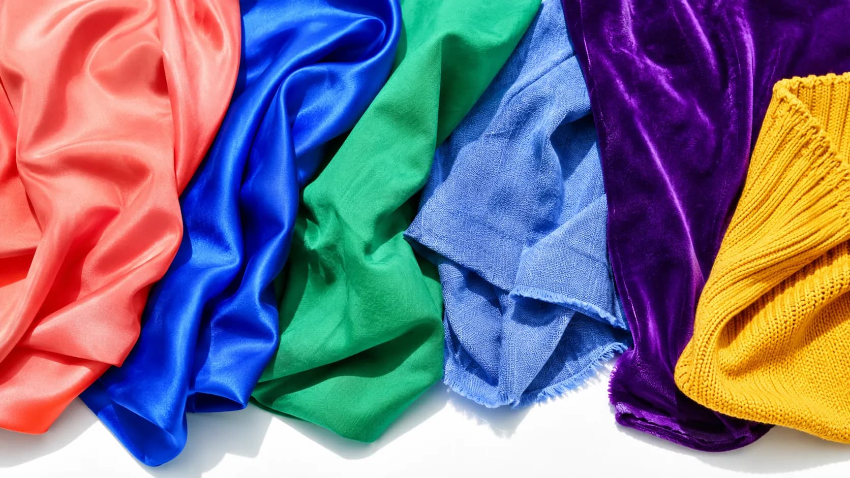
Shop by clarity first, temperature second. Clear Spring can wear both warm and cool colors as long as they're vivid and clean, so a bright cobalt blazer and a hot coral top can both work equally well. Skip muted, heathered, or dusty-finish fabrics regardless of the color family. The muted quality itself fights this palette more than temperature does.
Core Neutrals
Statement Colors
Clear Spring Hair Color Guide
At the salon, ask for rich, clear tones. Whether dark or light, the color needs to be clean rather than ashy or muddy. Bright warm blonde highlights woven through a rich dark brown base read as high-contrast dimension that matches Clear Spring's own natural clarity. Mousy, ashy, or muddy tones anywhere in the color undercut the clean brightness this palette depends on.
Clear Spring Makeup Guide
Clear Spring makeup should stay as clean and saturated as the clothing palette. A clear berry-pink lip and a clear teal-blue eye both read as polished because they match the coloring's natural clarity, not despite it. Satin and gloss finishes suit this palette better than matte, which can dull the clarity that defines Clear Spring. Keep muted or dusty tones off the face entirely, regardless of whether they lean warm or cool.
Your personalized report includes a complete makeup breakdown tailored to your specific color profile.
Prints and Patterns for Clear Spring
Clear Spring's high clarity means prints need to stay vivid and clean regardless of temperature. A pattern built from muted or dusty colors, warm or cool, will look flat against this palette's natural sharpness.
Color-blocking and clean geometric prints suit Clear Spring well, since their crisp edges and saturated colors both match the coloring's clarity.
Medium-scale patterns work best. Avoid anything too soft-edged or watercolor-style, which reads as muted even in bright colors.
Avoid prints that mix in any dusty or muted tone. Even one muted color in an otherwise-bright pattern will read as a mismatch.
Wearing Clear Spring Year-Round
Clear Spring's vivid, temperature-flexible palette translates easily across seasons since it isn't tied to strictly warm or cool colors. The same bright coral and clear cobalt work in cotton for summer and in wool for winter.
For colder months, layer in the palette's cooler-leaning brights (clear cobalt, bright periwinkle, electric violet) in heavier fabrics without needing to switch to muted tones.
For warmer months, the warmer-leaning brights (bright coral, hot coral, clear orange) shine in lightweight cottons and linens.
Clear Spring Jewelry: Bright, Clean Metals
Clear Spring's neutral undertone means both silver and yellow gold can work, as long as the finish is polished and bright rather than antiqued or brushed. Matte or oxidized metals read as muted, which fights this palette's clarity. Clean, high-shine finishes suit Clear Spring best, matching the crispness of the clothing palette.
Shopping for Clear Spring on a Budget
Start with one clean neutral, pure white or bright periwinkle, for a top or trousers, since these are easy to find at any price point. Add one or two of the most vivid colors (bright coral or electric green) in something small first, a scarf, a top, before investing in harder-to-find shades like electric violet or bright teal.
Frequently Asked Questions
Ashy Mousy Brown is the main color to avoid. It fights Clear Spring's need for clarity the same way a muted sage or dusty rose would in clothing. Clear Spring hair looks best in Rich Dark Brown as a base, with Bright Warm Blonde highlights and Deep Espresso lowlights: all clear, all high-contrast.
The core palette is Clear Pink, Yellow-Green, Deep Marine Blue, Bright Aqua, Electric Green, Aurora Red, Hot Coral, Pure White, Summer Sand, Brindle, Fuchsia Pink, and Bright Teal. Nouveau Navy, Vanilla Ice, Blue Radiance, Sharp Green, Geranium, Pink Lemonade, Chimera Grey, Ink Blue, Silver Lining, Orchid Pink, Geranium Pink, and Raspberry Radiance round out the full 24-color set.
Black isn't on this palette's avoid list, but it's not a defining neutral either. Deep Marine Blue or Ink Blue does more for Clear Spring's clarity than black does, which can read as slightly heavy against such a bright palette.
Want the traits behind this palette? Read the full Clear Spring Color Analysis →
Are you a Clear Spring?
Take our free 3-minute quiz to find your exact color season — no email required.
Find My Season →